
Soon after the first set of design mockups for the GoCompare Home Insurance journey were ready, I faced a familiar communication challenge. Only this time, I was the designer.
The problem
I was the first UX designer to join GoCompare. It became very real as I first tried to communicate intricate user interface designs for an entire product journey to the development team. At the time engineering focus was not so much on the front-end implementation, and relying on providing flat design mockups without any directions wasn’t going to work.
As a web developer I used to sit down with designers to perform “pixel-pushing” sessions. Those were aimed at polishing the front-end implementation to get the designer vision just right. This approach worked well in the context of a creative agency, but trying the same in a corporate environment, across departments, as I was just getting started, was going to be challenging.
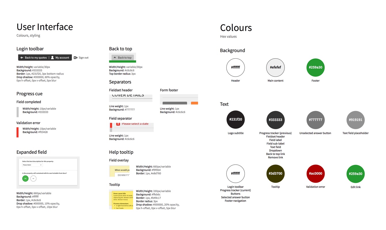
With the first release of the Home Insurance journey getting closer, I mocked up guidelines documenting the designs (colours, dimensions, font sizes, etc.) for the developers. It worked to some extend and we successfully achieved the first few releases this way.
These releases were good enough but frustrating as not quite achieving the vision the team worked hard to shape up. And with each new design updates the guidelines needed to be updated as well, which started to become very time consuming and not manageable. So I looked for an alternative.

My approach
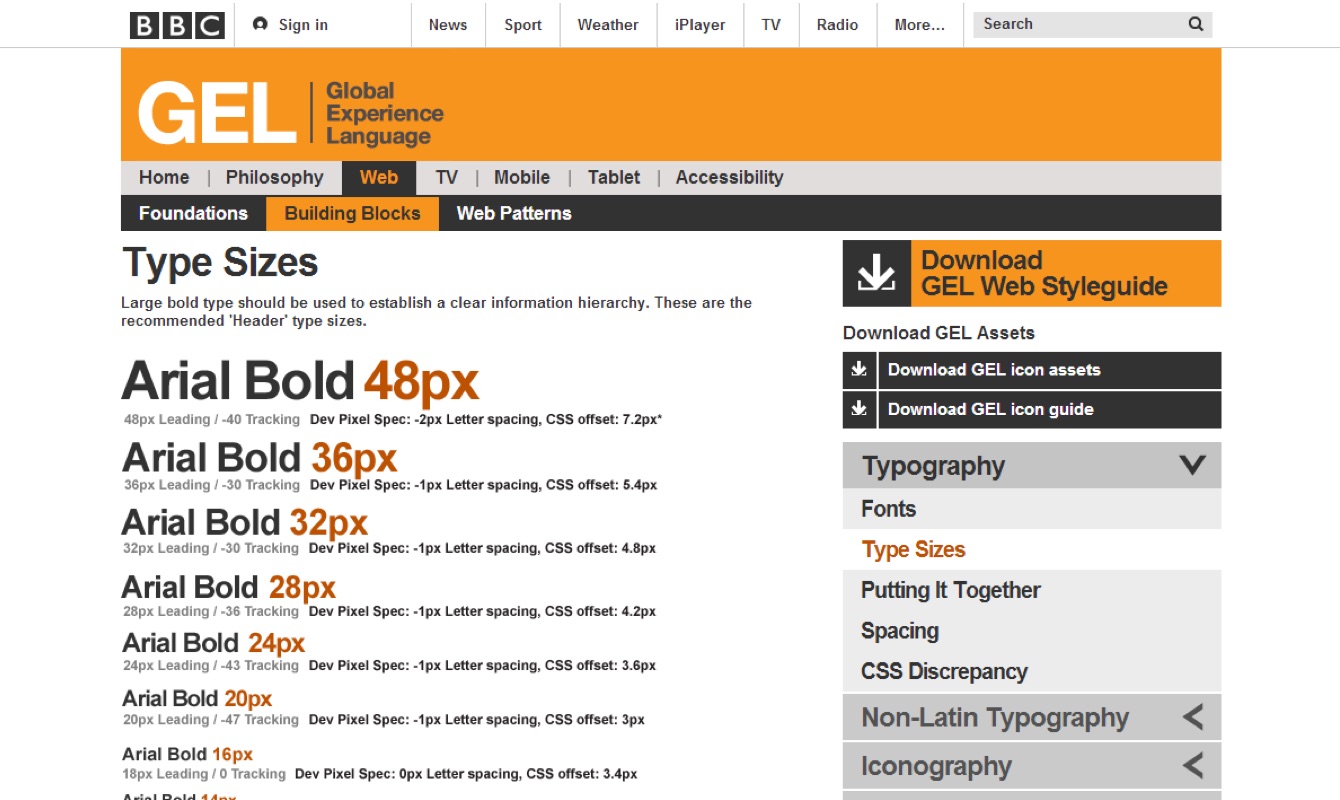
I started reading about “live style guides”, with the likes of Google’s Material Design, BBC’s GEL or Mozilla Style guide as key inspiration. Those were coded guidelines with each elements actually rendered in the browser using Html and Css. It felt like a much more scalable approach, and something I would be able to do. So I started experimenting with the idea.

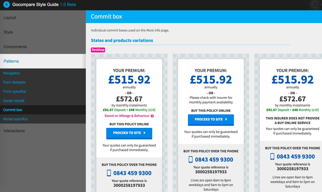
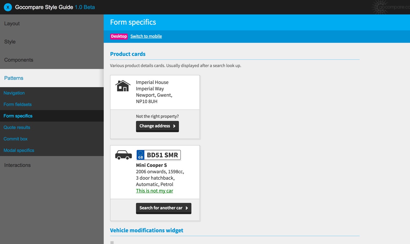
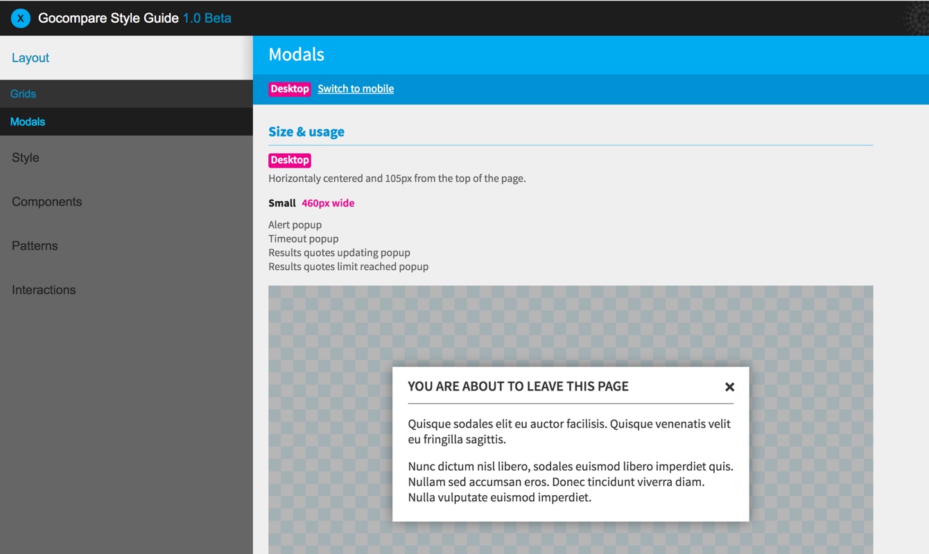
The first step was to break down the Home Insurance design mockups into small parts, to highlight common patterns, categorise them and flag any inconsistencies.
Along with my team mate we ran an interface inventory of the Home Insurance journey. We printed every single design mockup and ended up with a wall full of post-its listing everything we could name: icons, text fields, headings, modals, interactions, …

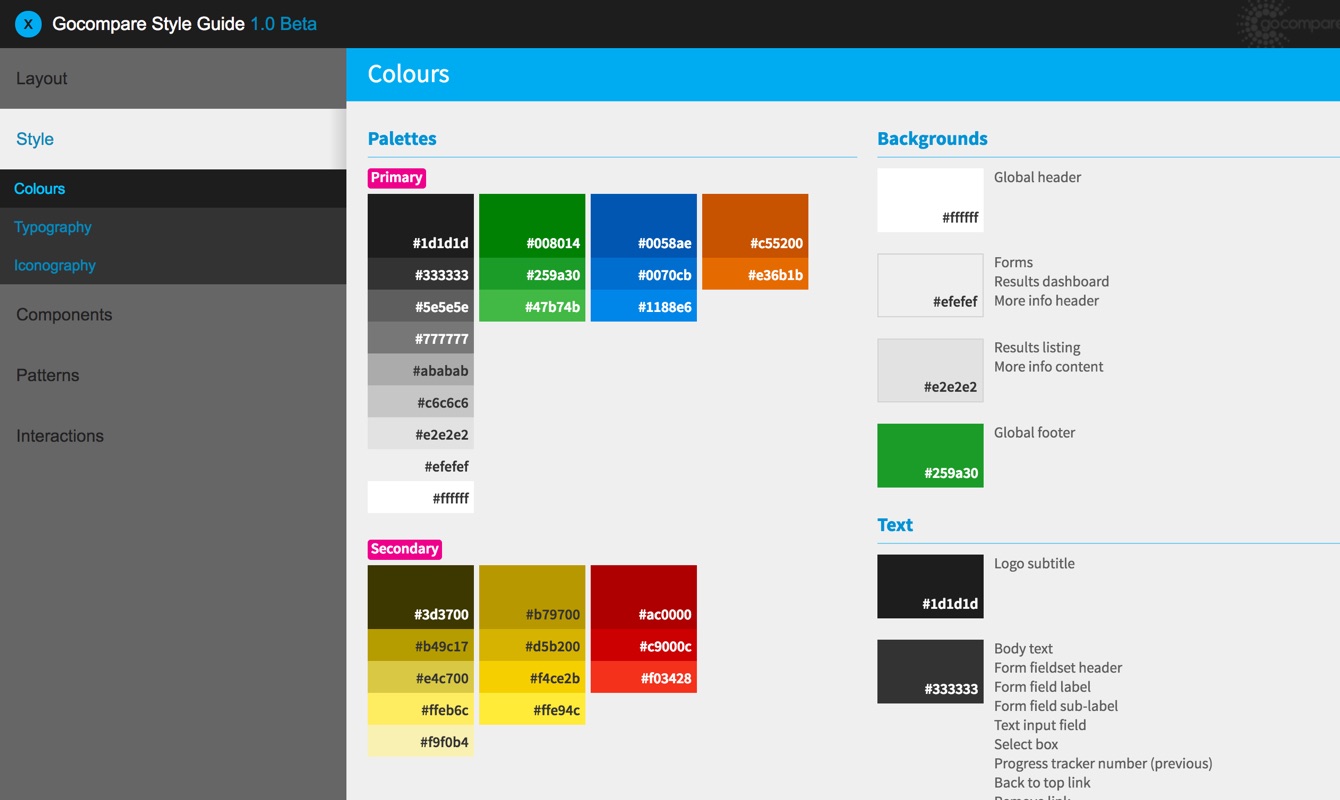
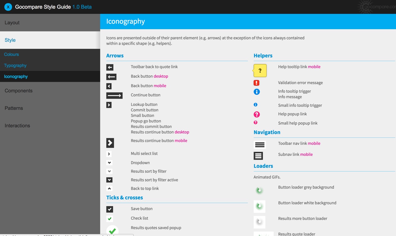
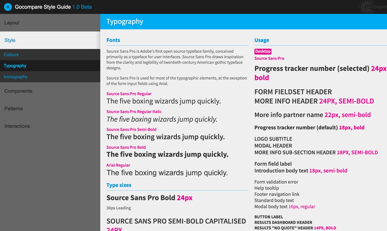
Back to my development days, I started coding small parts of the design – buttons, basic form elements, text styles – making sure every aspect of each element was being considered (focus, hover, active states, …) and using best practices (comments, semantics, accessibility, …).
In parallel, I crafted a simple website to document and share these live components, and organised them using sections defined during the interface inventory. The style guide was there.

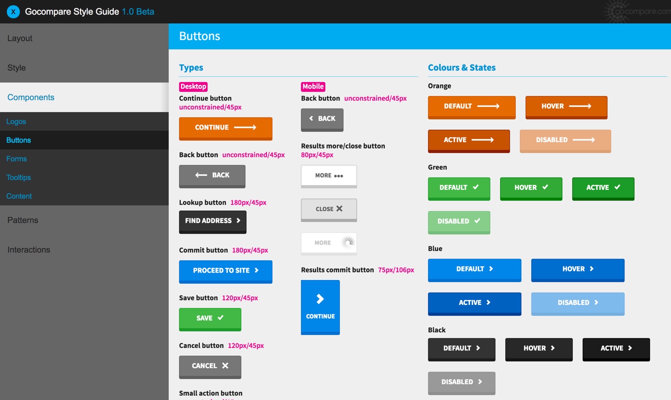
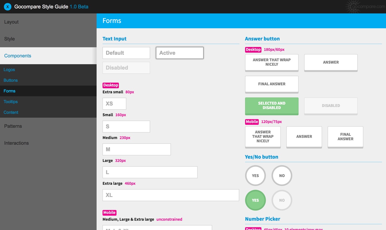
This process was completely different from coding front-end templates as I used to. By focusing on building the atomic elements first, and considering them as individual components ready to be used in any context, I could then easily combine them to create larger components, and ultimately, fully realised front-end prototypes.

Next
The first version of the style guide was released internally in late 2014. Since then, it has been used for the implementation of more than 20 products redesigns, but also the homepage, landing pages and more. It has hugely contributed to improve the consistency and the quality of the GoCompare digital presence, and is an invaluable tool to communicate designs with external partners.
It also turned into a very handy prototyping environment for designers, from quickly building up an entire product journey hi-fidelity prototype to setting up multi variant tests.
The GoCompare Style Guide is still being developed today. Pushing the concept further towards seamless integration and communication between design and engineering.


The views expressed in this article are my own and are not intended to reflect those of GoCompare. The content used within this article is exclusively used to illustrate my key career achievements so far.