One of the reasons GoCompare was looking for in-house UX design expertise back in 2014 was to adapt to the changing customer habits. Growing usage of mobile devices required a move towards a customer-centric approach to the services offered. And so my journey as a UX Designer began.
The problem
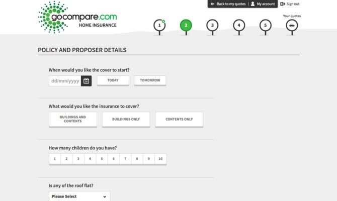
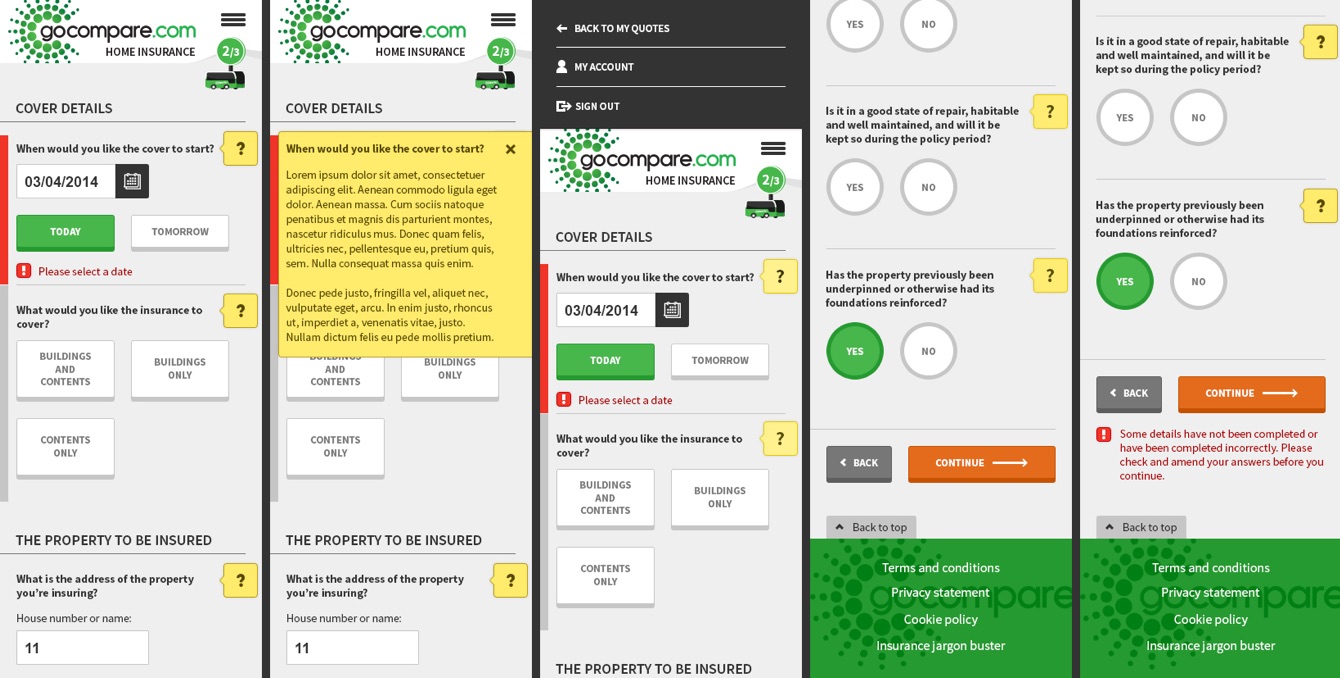
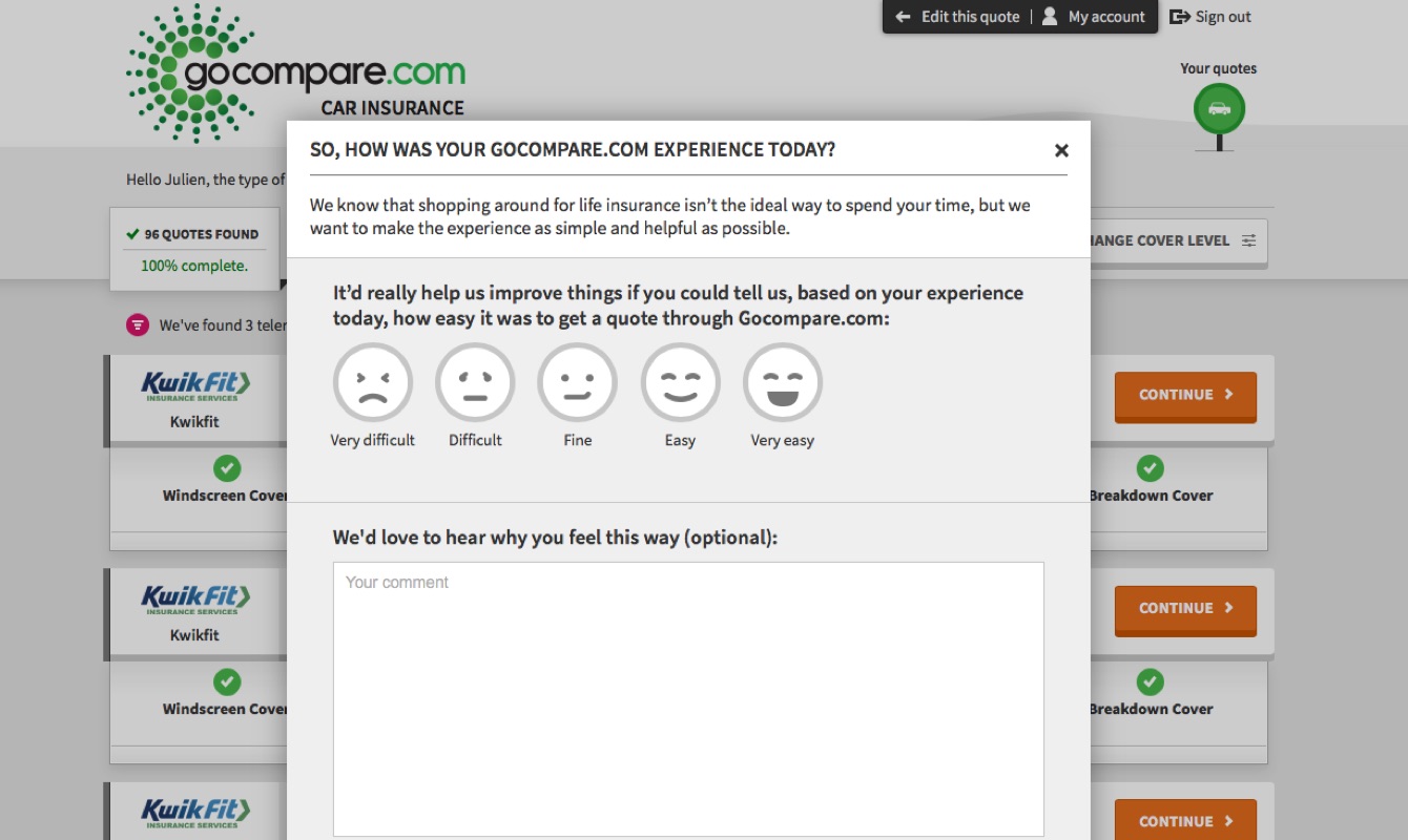
On my first day in the office, the goal was clear: the Home insurance comparison journey needed to be easier to use, designed for mobile, and better looking. Usage metrics were unanimous: people love using their mobile devices more each month, and digital experiences not responding to this trend will soon become obsolete.
I quickly realised this wasn’t going to be a simple one-off redesign job. It would require building a system that will shape the next generation of GoCompare products.
Back in 2014, the GoCompare product visual and user experience was fragmented. Something was missing to hold it all together and provide a consistently usable and predictable experience for the customer.
My approach
Some of the core principles were already defined ahead of my arrival, such as the usage of a single column form layout, large and touch-friendly buttons, and of course a strong focus on the mobile execution.
My background in financial products and price comparison websites was somewhat limited at the time, having never switched any insurance before, but I knew forms, I built a lot of them, designed a few. I also knew of the GoCompare brand, remembering some of the TV ads featuring a loud opera singer with a moustache.
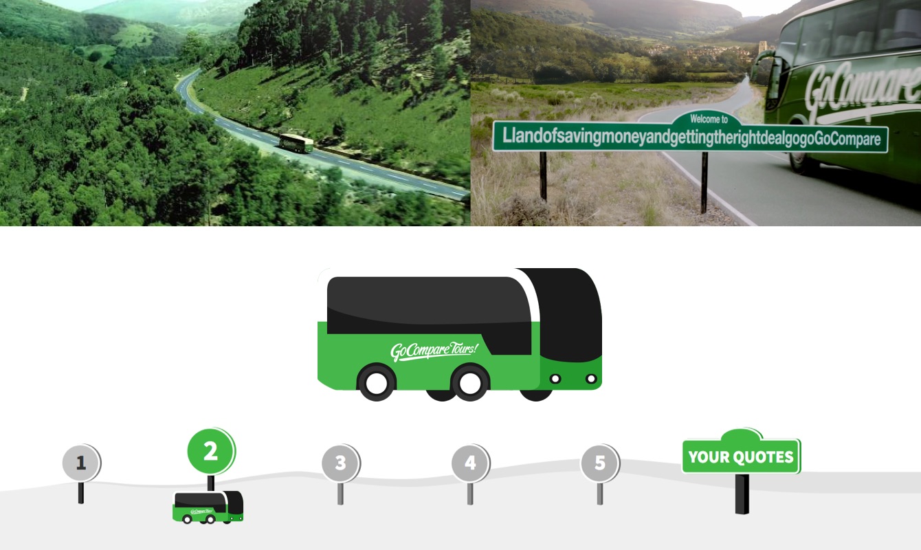
Compiling some of these brand assets opened up to some playful ideas. Turning the coach, signposts, and bendy Welsh country roads from the 2013/14 ad campaign, into the product journeys’ sense of continuity and progression. Still, I refrained from integrating too many visual cues, to ensure the functionality and scalability of the framework I was designing.
I stated the obvious by exploring the experience offered by the other main price comparison websites. I’m pretty cautious about this as it is often too easy to be either too critical of the competition or too accepting of others’ solutions, especially when playing in the exact same field. It’s definitely useful but I made sure to keep this mostly for reference and awareness of the marketplace. I favour looking for inspiration through unrelated subjects matters, searching for what feels right through personal experiences and unforced explorations.
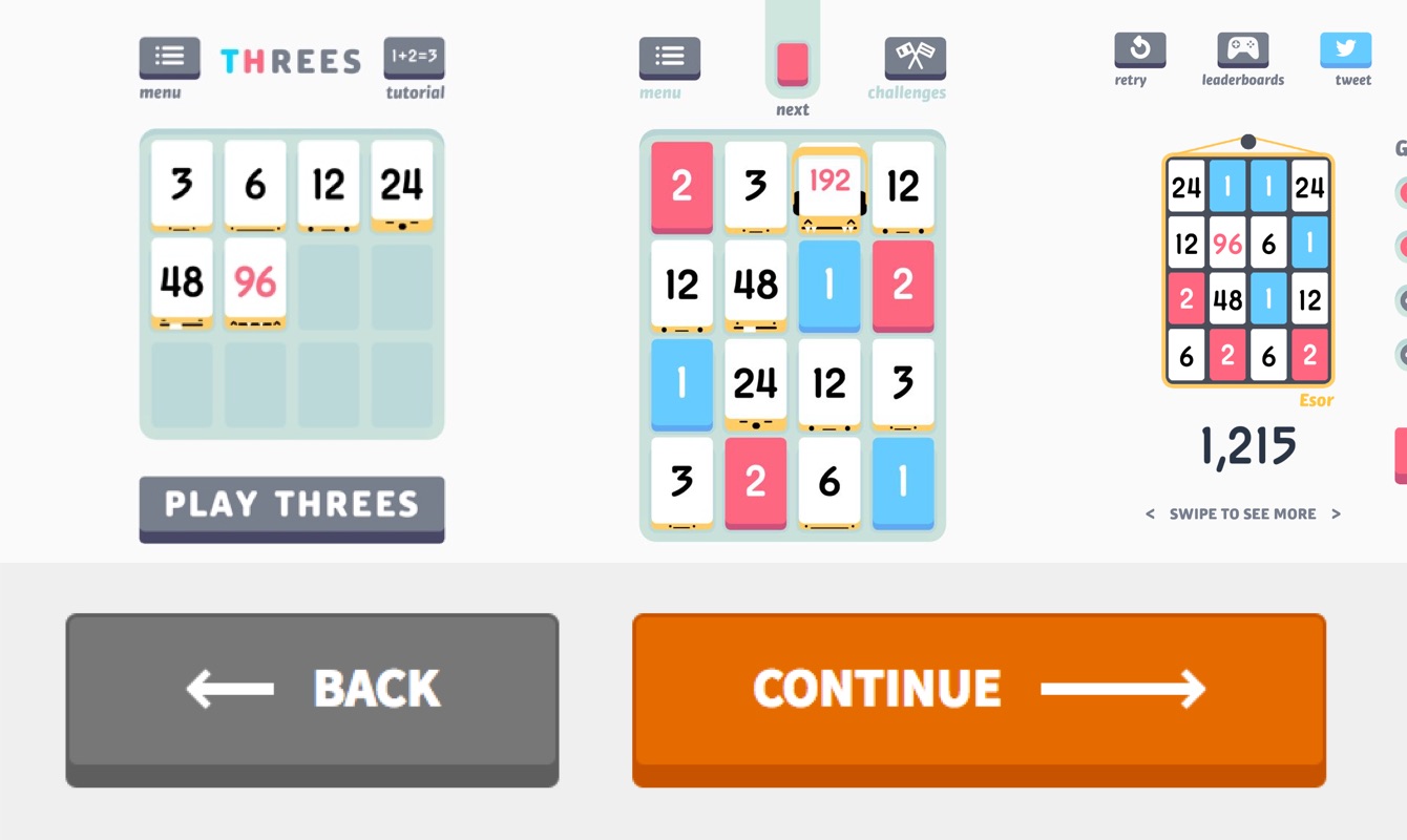
As an example, I’m a big fan of the mobile game Threes, as much for its brilliant concept as for its playful art styles and lovely user interface, especially the buttons and tiles. This naturally contributed as one of my inspirations for designing tactile and desirable interactions that would engage the user without being in the way of the user goals.
Writing down a check list of everything I needed to consider for this redesign helped me to make continuous progress each day:
- How many key steps, screens, need to be designed?
- What are the UI components that need to be revised? Why and how?
- Which existing visual reference, guidelines, brand assets, can I use?
- How does the mobile and desktop experience influence each other?
- What best practices can I introduce? Are there any existing quality standards I should follow?
- What does research, behaviour, data, can tell me on the current user experience?
- How is everything going to be implemented technically? What is the release plan?
- …
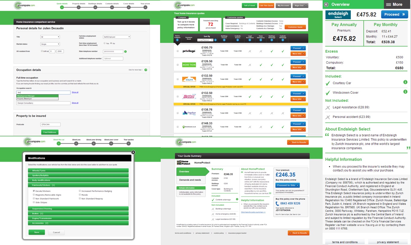
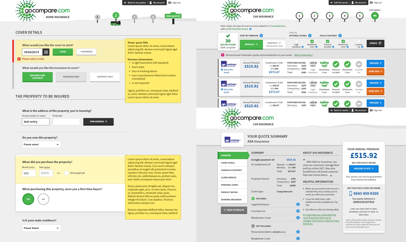
The logical separation between the journey question set, the quote results and the more info page helped me phase the delivery of the designs.
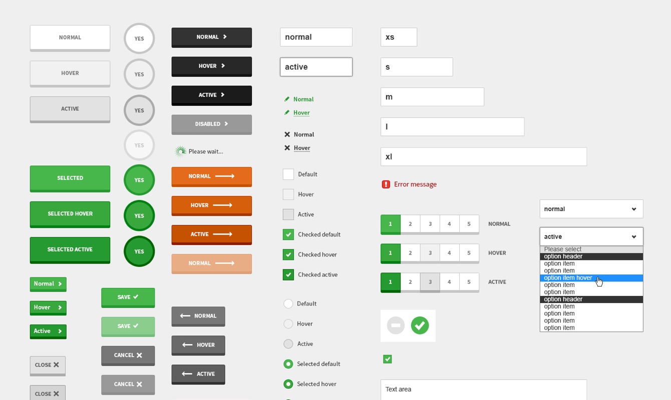
I spent time thinking through and documenting all interactions and requirements for every single components, so the larger components could safely trust and use them:
- How should a button behave on a mobile and a desktop? What happens once a button gets clicked or tapped, in different contexts?
- How do the help tooltips get switched on and off on a mobile and a desktop?
- Do validation error messages require different treatment for inline validation?
- How can the content of a modal be scrolled through on a mobile device?
- How to manage info tooltip interactions on mobile and desktop?
- …
Bringing it all together for the Home Insurance journey was always going to be a challenge because of the tight deadlines, but there couldn’t have been a better proof of concept and source of learning for what followed.
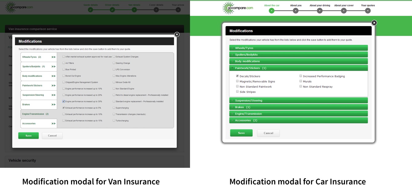
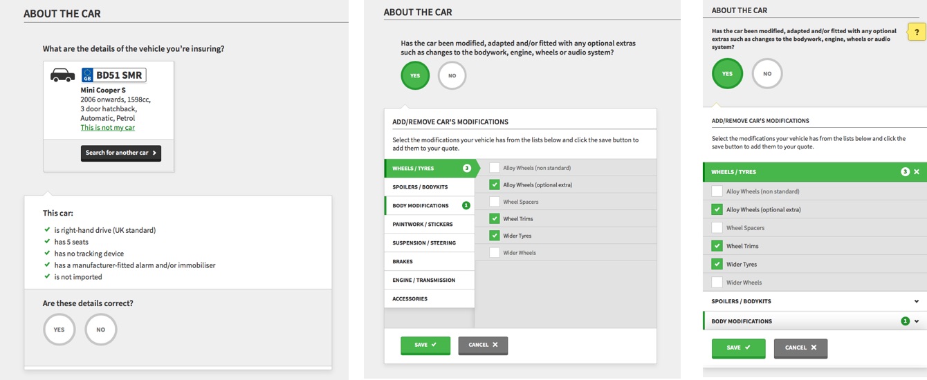
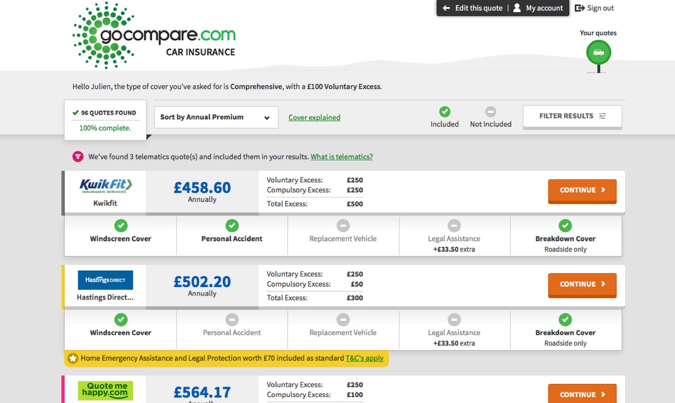
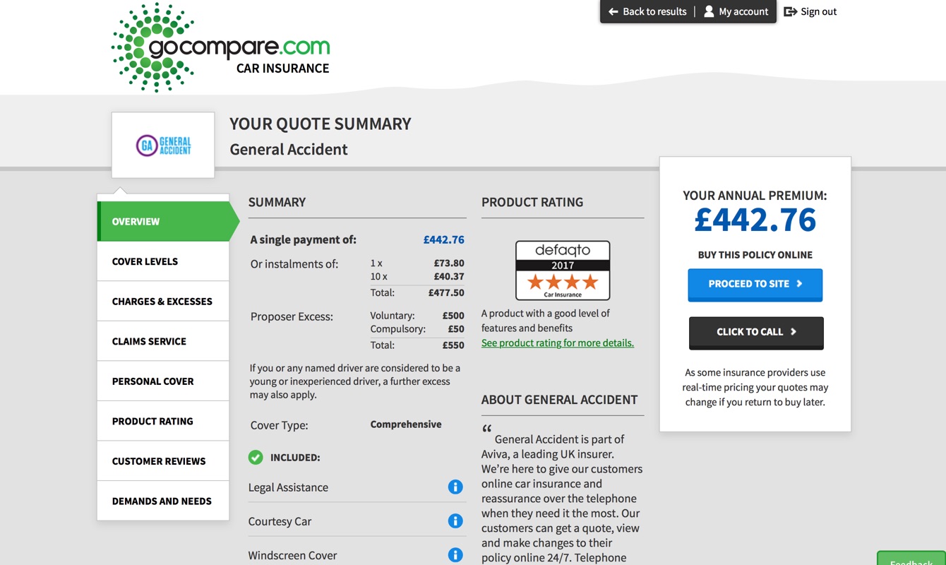
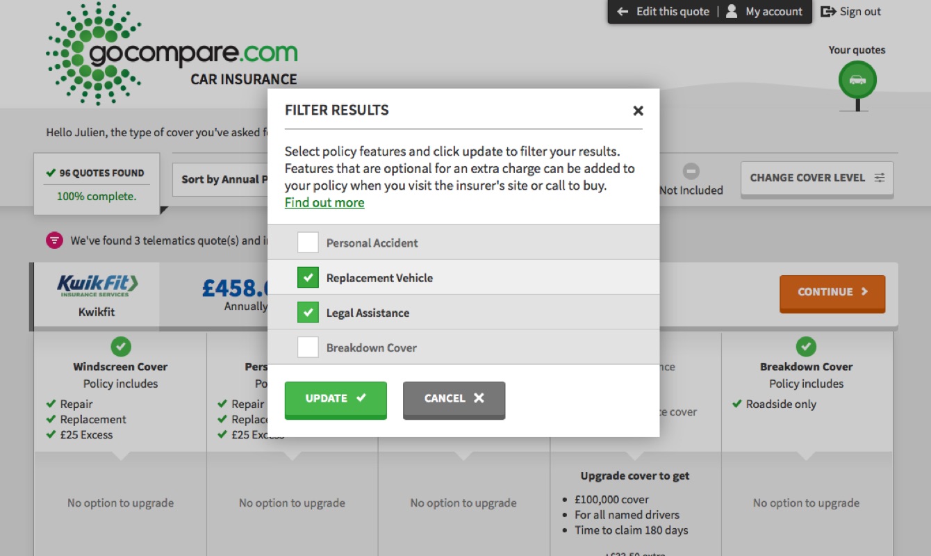
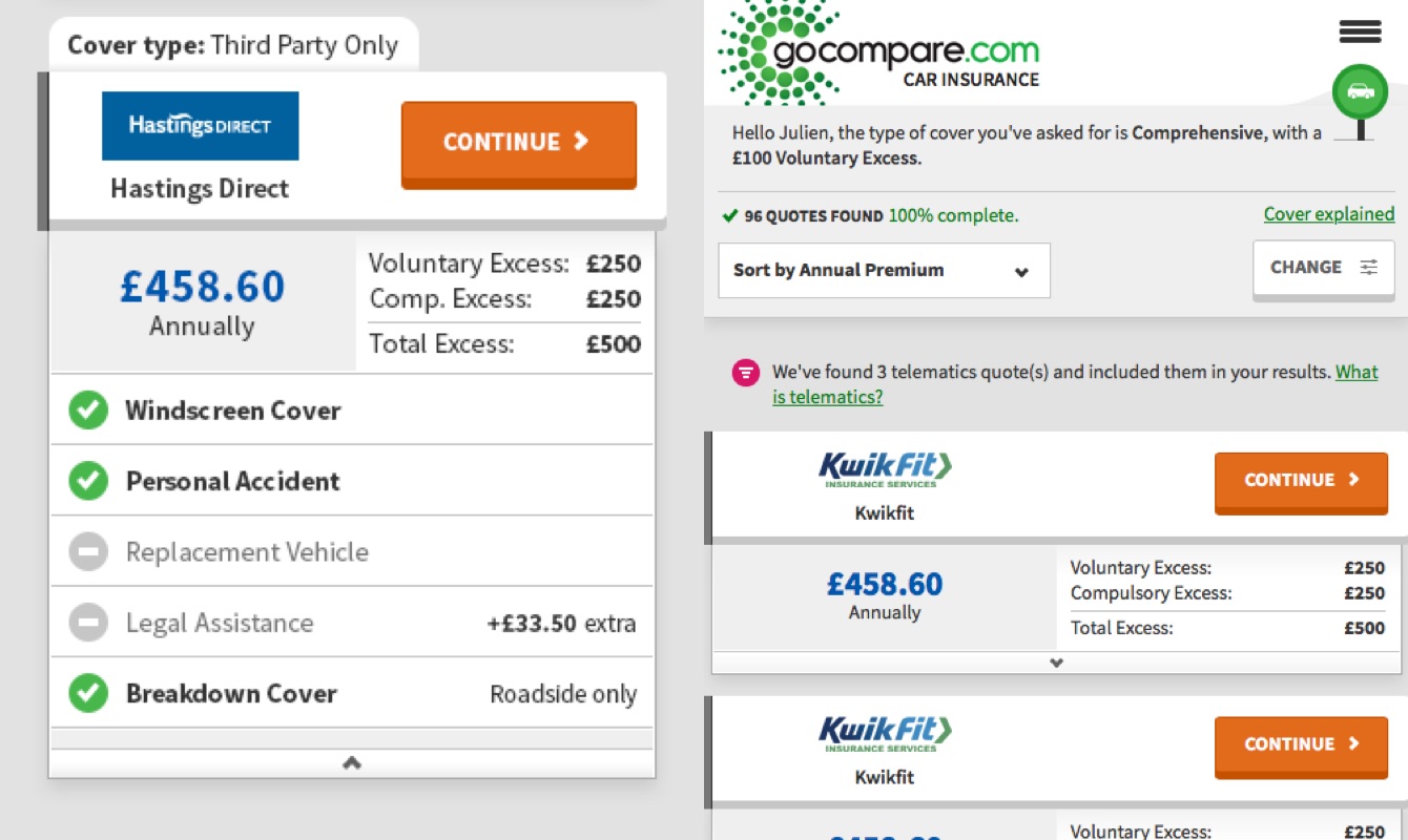
I iterated and consolidated the user interface for the Car Insurance journey, by introducing brand new vehicle lookup and vehicle modifications components, optimising the quote result and more info pages, and tightening up the overall journey responsive layout and steps navigation system.

Next
Over the course of two years, this product journey user interface has been trusted, developed and implemented through 20+ different GoCompare products, from in-house solutions to white label partnerships, defining a new consistent visual identity for the GoCompare product journeys, supporting the growth of the existing product lines and the introduction of new ones.
Nowadays a growing team of designers is consistently at work evolving these foundations, refining its effectiveness through behaviour and data analysis.
As a designer, this project taught me how to approach building a solid and scalable components’ boiler plate on which a wide range of products, sometimes very different, can rely on. I’ve also learnt how important it is to keep an open mind even once these foundations are defined and built, to always allow innovation and creation to play their part.
A few messages from customers posted since this redesign (Car and Home Insurance, 2016):
“Simple and straight forward and less stressful thank you”
“It was easy to use, the quotes were broken down in easy to follow. I could find exactly what I was looking for”
“Was the easiest way to buy motor insurance ever”
“Far better service than calling around. Easy to compare the service you require, even bringing to your attention companies you would not thought of.”
“Very slick, easy to understand procedure.”

The views expressed in this article are my own and are not intended to reflect those of GoCompare. The content used within this article is exclusively used to illustrate my key career achievements so far.